55 Photoshop Hearts Shapes for Romantic Designs
55 Photoshop Hearts Shapes for Romantic Designs
0 comments
Design a Awesome Supernatural Dark Scene with Fiery Effect in Photoshop
0 comments
Ultimate Round Up of Free Photoshop Patterns
0 comments
Photoshop users can save a lot of time and create beautiful designs by using patterns. Photoshop’s presets (like brushes, styles, patterns, custom shapes, and gradients) are highly-powerful tools when used effectively.
Whether you are creating your own custom patterns or using pre-made patterns that you have downloaded for free or purchased, having an arsenal of patterns at your disposal will allow you to quickly create high-quality work.
In this post we’ll showcase 50 sets of free Photoshop patterns for your own use. You may also be interested in our recent post, Ultimate Collection of Free Photoshop Styles.


Tileable Stone, Pavement, and Marble Textures

Vintage Retro Grunge Wallpaper Patterns


Grungy Natural Beige Patterns – Part 2

Seamless Colorful Grunge Polkadot Patterns


For more resources please see:
- 40 Sites for Finding Web Design Jobs
- 25 Excellent jQuery Slider Plugins and Tutorials
- 45 Amazing and Free Photoshop Actions
- 30 of the Best Websites for Online Photo Editing
- Adobe Illustrator Brushes: Best of
Surprise someone with a Photoshop Fine Art Portrait
0 comments
In this tutorial, we’ll be looking at how to transform a photo of a person into a work of art – in this case, a highly illustrated sketch art piece.
Vector shapes and textures will also be added to our composition as this will give our sketch artwork more depth and character. Below are examples of what you could achieve even with the simplest of art forms (pop art etc) to create interesting and beautiful effects from a picture. The final images could used as e-cards, profile pictures/avatars, wallpapers and so on.


Step 1
I start with a new document with a white background layer. The dimensions of your documents are of course entirely your choice depending on the size of the picture you’re working with. I’ll be using this picture from istockphoto.

Step 2
Remove the background of the image by creating a Layer Mask clicking the third button from the left. Its located at the base of the Layers Palette. Then press Ctrl+D to make sure that the foreground colour is set to black and with a Soft Round brush (B), (have its hardness increased to about 45
to 60 per cent) paint away to remove the background.
When done, Press Shift+Ctrl+Uto desaturate the ‘Man’ layer.

Step 3
Duplicate the ‘Man’ layer by pressing Ctrl+J and head on over to Image>Adjustment>Invert or just press Ctrl+Ito invert the layer. Also, change the layer’s Blend mode to Color Dodge. The image in the ‘Man inverted’ layer would apparently disappear at this point.

Step 4
The image in the layer will be given more visibility when we have it blur a little. Go to Filter>Blur>Gaussian Blur and set the Blur Radius to about 14.2 pixels and this as a matter of fact, all depends on the results that
suits your likings. The result you get eventually, is nicely rendered sketch effect.

Step 5
To further enhance the pencil-like effects of our simulated sketch, select the duplicate the ‘Man inverted’ layer and go to Filter>Sketch>Graphic Pen. Make the adjustments as shown below:

Step 6
Set the layer’s Blend mode to Lighten and reduce its Opacity to about 23%. Name the layer ‘Graphics’.

B.
Not to make the Graphic Pen effect to brash, go to Edit> Fade Graphic Pen or press Shift+Ctrl+F and reduce the opacity of the effect down to about 60% until you’re satisfied with the results.
Step 7
For a new layer, with a Hard brush selected, paint the eyes of the in the image. Use any colour of your fancy. Set the Blend mode of the ‘Eyes’ layer to Overlay.

Step 8
We’ll now create custom pen strokes to enhance our sketch. Please do use your creative license here to express yourself. Well, with the Pen Tool (P) selected, create Anchor Points over the edges of the head. To create curves, just click and drag in the direction you want the curves created. That done, we’ll now add a stroke to the path. But first, run these checks: make sure your brush’s opacity is appropriate, the brush size should be set to about 2px to 3px and the foreground colour is switched to your desired colour.

Step 9
Still with the Pen Tool, right-click the path and select Stroke Path.

Step 10
On the Stroke Path Dialog box, select Brush and check Simulate Pressure. This creates a nice fading effect to your brush strokes. Use the Marquee Tool (M), to clear the Pen path and then hit Ctrl+D to deselect.

Ive disable the ‘Man’ layers to show you the strokes Ive made with Four
colours, thickness and varying opacities.

The final results:

Step 11
Now, we’ll add vector elements to our image. Select the Rectangle Tool (U) and on its Options bar, set the shape type to “Paths.” Draw a flat rectangle.

Step 12
Select the ‘Add Anchor Point’ Pen Tool and then create points at points on the rectangle. 2. Select the Direct Select Tool (A), and use it to adjust the anchor points to form curves.

Step 13
Double-click the vector layer for a Layer style and set the parameters below:

Step 14
In a new layer, draw an ellipse with the Elliptical Marquee Tool. Paint on the base of the selection with a white Soft Round brush. Reduce the opacity of the layer to about 43%. Add some other shapes to the umbrella – handles etc.

Step 15
Duplicate the Umbrella shape layer and right-click this copy and select the Rasterize Layer option.

Step 16
The Paint Bucket (G), can be used to change the colour of the shape. Reduce the the opacities of the both ‘Umbrella’ layers to 63% and 49% respectively.

Step 17
With the Custom Shape Tool selected, pick the ‘Circle Frame’ shape.

Step 18
Create a couple of circles in separate layers and at reduced opacities.

Step 19
Draw a circle and add a Gradient Overlay Style to it with the settings
below:

Step 20
Reduce the opacity of the circle to43%.

Step 21
Download these great looking halftone brushes from Env1ro. 3D halftones they’re called.

Step 22
Set the foreground colour to #ccccccand add these dots to you image.

Step 23
Add some other vector shapes of your choice.
- Swirlsdownloaded from www.brusheezy.com
- Treesdownloaded from snap2objects.com

Step 24
Its also a good idea to add texture your image as this deepens the entire outlook the composition. This rock texture was downloaded from freetextures.org. Place the rock texture over all other layers and
desaturate it. Set texture layer’s Blend mode to Color Burn and reduce its opacity to 69%.

Step 25
Create a Layer Mask for the texture and clear any trace of the texture from the man image.

Step 26
More texturing. Download these set of Grunge Texture brushes
fromART-D. Apply the brush and add a Shadow Overlay style to the brush mark.

Step 27
Erase areas of brush mark via a Layer Mask and this time, use a Spatter brush instead.

And we have our final result!

You can even take your artwork a little further as Ive done below. Just
imagine the possibilities! I hope this post would be of use to you.


Weekly Design News – Resources, Tutorials and Freebies (N.91)
0 comments
This is our weekly column were we share our favorites design related articles, resources and resources all from the previous week.
If you would like to be kept up to date with loads of fresh design news and resources, you can follow us on Twitter, on Facebook, on Stumbleupon or by subscribing to our RSS feed.
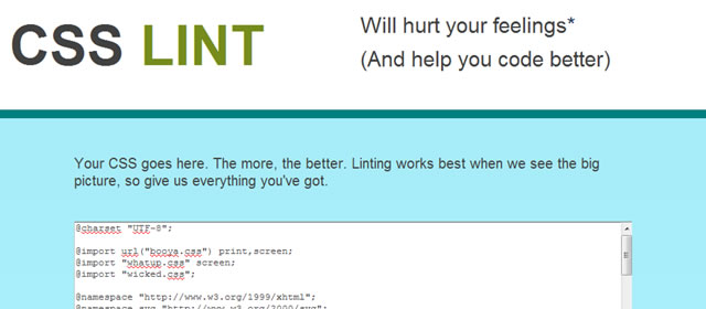
CSS Lint
Perkins CSS3 LESS Framework

Gridless – Boilerplate for Responsive, Cross-Browser Websites

TN3 Gallery – jQuery Image Gallery
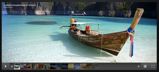
TN3 Gallery – jQuery Image Gallery →
Craftyslide – A tiny jQuery Slideshow Plugin

Craftyslide – A tiny jQuery Slideshow Plugin →
Prototype Quickly with flickrBomb
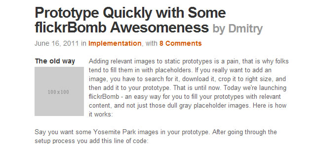
Prototype Quickly with flickrBomb →
Javascript Frameworks and jQuery (Infographic)

Javascript Frameworks and jQuery (Infographic) →
Useful Resources, Tools and Services for Web Designers

Useful Resources, Tools and Services for Web Designers →
8 New Free Fonts for Your Designs

8 New Free Fonts for Your Designs →
The Web Font Combinator

100 Días de Tipografía (100 Days of Typography)

Making a Beautiful HTML5 Portfolio (Tutorial)

Making a Beautiful HTML5 Portfolio →
How to Create an iPad 2 From Scratch Using Photoshop

How to Create an iPad 2 From Scratch Using Photoshop →
White & Blue Web Ui Kit (PSD)
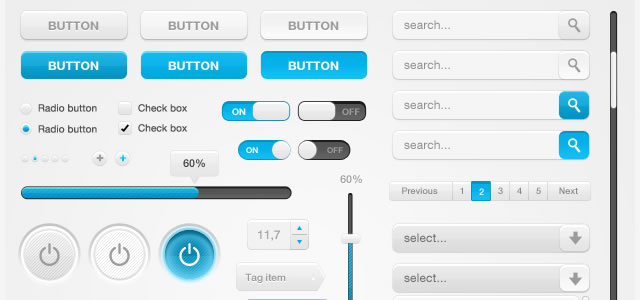
White & Blue Web Ui Kit (PSD) →
Scout Badge Icon Set

8 Beautiful Cameras Icons (PSD)
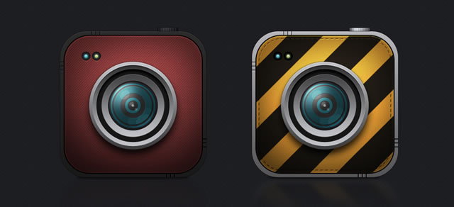
8 Beautiful Cameras Icons (PSD) →
Previous Weekly Design News…
Design News Roundup Archives →
Creating an Enticingly Beautiful Poster in Photoshop
0 comments
100 Best Photoshop Tutorials For Upcoming Designers
0 comments
The Simple Guide to Text Effects using Layer Styles
0 comments
Typography plays a key part in many kinds of design. Some would even say it’s the most important element of web design, in order to correctly portray your message you have to invite the user to read what you have to say. So how do you make your type stand out? In today’s tutorial I want to cover some of the basics of modifying text using Layer Styles in Photoshop. We’ll learn how to create the “letterpress” look, how to overlay textures and patterns, and how to use tools like Stroke and Bevel. Let’s get things started.
Preview:

We’ll be creating three separate kinds of text styles:
- Creating Letterpress Text
- Overlaying Patterns on Text
- Creating Retro Type using the Stroke Tool
1.) How to create letterpress text.
Letterpress style text has been a staple of web design for a number of years now, and for good reason… it’s slick, stylish, and easy to create.
Step 1
Create a new document sized 485px x 350px and fill it with the color #205175. Add some noise to the background using Filter > Noise > Add Noise using the settings below.

Step 2
Add a white radial gradient to the background before adding your text. Here I’ve use the font Bitstream Serif and the color is #554639.

Step 3
Now it’s time to start styling the text. Open up the Layer Styles window by double clicking on your text layer. Firstly we’ll add a black to white gradient with an opacity of 47% and a the blend mode set to Soft Light.

Step 4
Next we’ll start on the letterpress look by adding an inner shadow. Set the distance to 2px and the size to 4px.

Step 5
To finish off the text we’ll add a light drop shadow that helps complete the letterpress feeling by adding a highlight. Here I’ve used the color #95bcd6, set the distance to 1 pixel, and used an opacity of 78%. And that’s it! See how easy it is to make good looking text?

2.) Overlaying patterns on text.
Overlaying patterns and textures on top of your text can help give some extra visual style to your work and helps to draw the reader in.
Step 1
I’ve created a new document and imported one of these paper textures to use as a background. The font used here is called ChunkFive set to 18pt.

Step 2
Open up the Layer Styles window and select Pattern Overlay. With this tool you can overlay and seamless patterns or textures on top of your text. Here I’ve chosen a seamless wood texture.

Step 3
Next we’ll add a small gradient overlay to the text to help give it a bit more of a three dimensional look. Set the blend mode to overlay and the opacity to 34%.

Step 4
Next we’ll add a drop shadow with a distance of 2px and a size of 2px, with an opacity of 53%.

Step 5
Adding a 1px white inner shadow helps give the text a small highlist and really makes it pop.

Step 6
Lastly we’ll use the Bevel and Emboss tool. I know a lot of designers look down on this particular tool, but I think if it’s used subtly enough it looks pretty good… just don’t overdo it. I’ve set the depth to 1%, the size to 3px, and the shading angle to 90*.
And that completes the wood text! See how easy it is? Hopefully you’re getting the hang of it now.

3.) Creating retro type using the stroke tool.
For the last part of this tut we’ll combine a number of different layer style tools to create text that has a nice retro feel to it.
Step 1
I’ve create a new document, added a simple striped pattern and gradient to the background. The font used here is ABTS Milk and is available through Jay’s FontDeals. The color is #9feef5.

Step 2
Next open up the Layer Styles window and we’ll start off by adding a gradient stroke to the text. Set the size of the stroke to 5px and use a gradient similar to below.

Here is a preview of the gradient that I’ve used:

Step 3
Next we’ll add a subtle gradient to the text. I’ve set the opacity to 70% with a blending mode of screen.

Step 4
Next we’ll use the Inner Glow tool to add a little more detail. I’ve set the color to #eef3ff, the size to 2px, and an opacity of 79%.

Step 5
Use the Bevel and Emboss tool too add a little more depth to the text. I’ve set the size to 2px, depth to 1%, and shading angle to 160*.

Step 6
Lastly we’ll add a heavy drop shadow to help the entire thing “pop” from the background a little bit. Set the distance to 9px, size to 16px, and opacity to 21%.
And that’s it! Now you have a nice looking, basic retro logo that can be made in less than 5 minutes.

Conclusion
This tutorial was intended to touch on just the basics of what you can do with Layer Styles. If you enjoyed it and felt like you learned something new please let me know. I’d love to make some more in depth tutorials about modifying text in Photoshop in the near future.
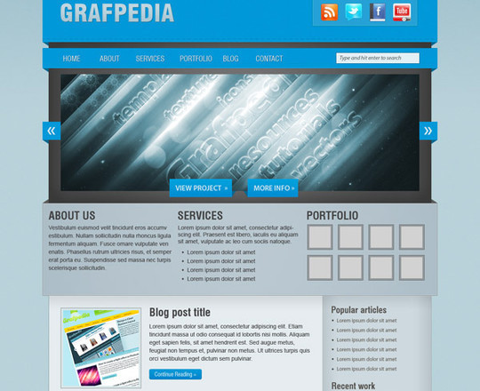
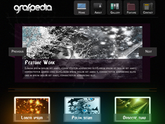
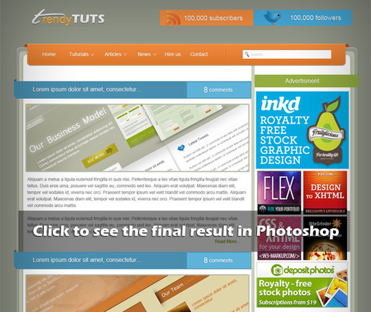
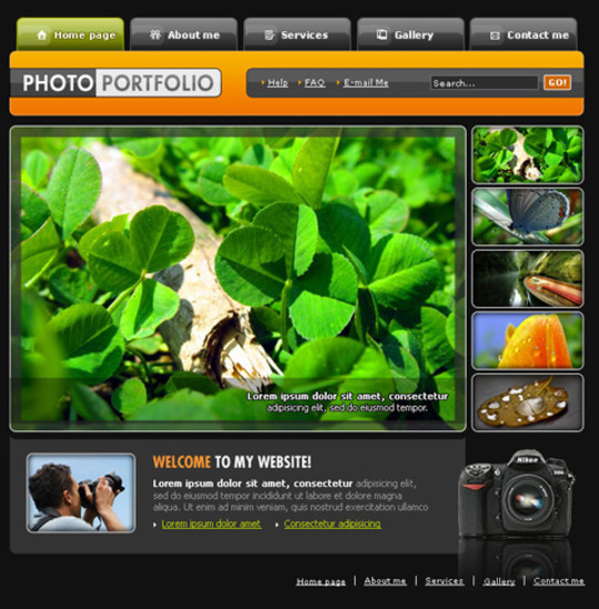
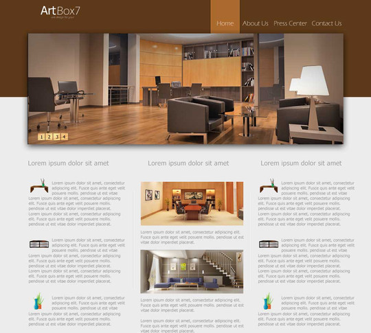
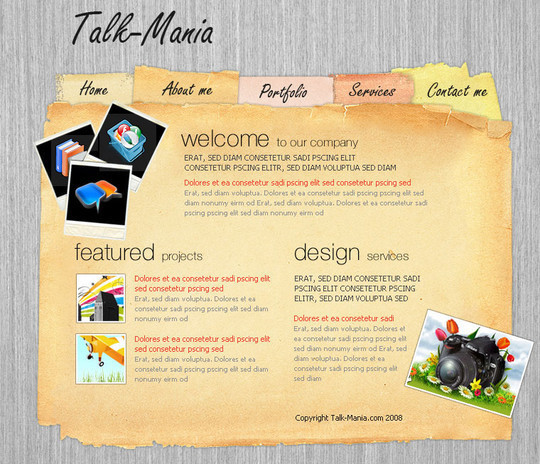
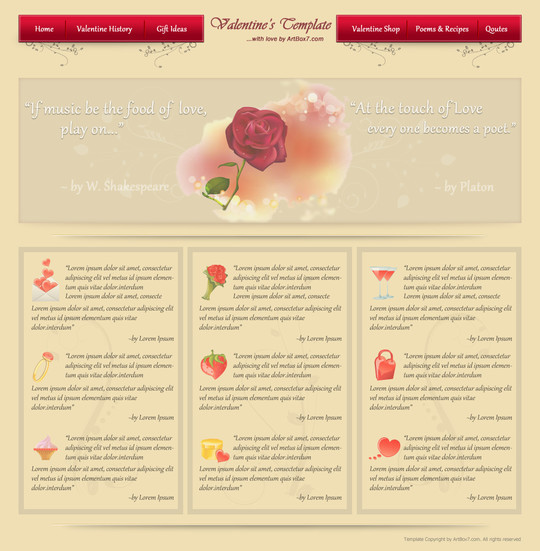
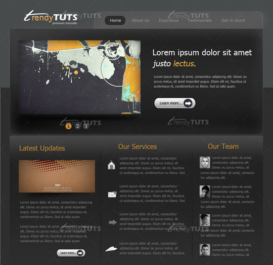
50 Truly Eye-Catching And Detailed Web Layout Tutorials
0 comments
An eye-catching web layout can help capture the attention of your potential customers by giving them a feel of confidence and trust. Designers mainly use Adobe Photoshop to create beautiful and stunning designs. Adobe Photoshop is the most widely used graphics software that is being employed all over the world.
Here we are showing 50+ most useful tutorials of Adobe Photoshop that show you the creation of beautiful web layouts by the sole use of Photoshop. We hope that you enjoy this collection.
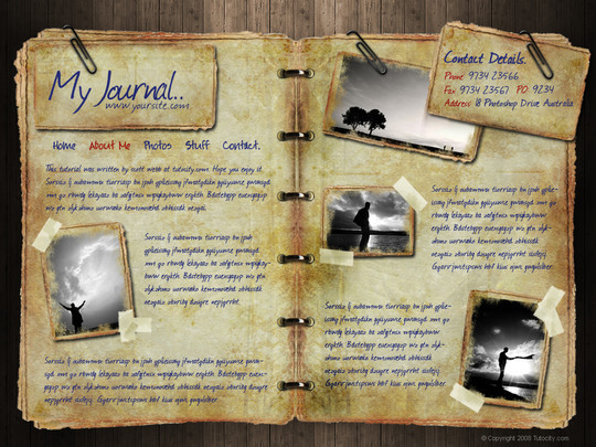
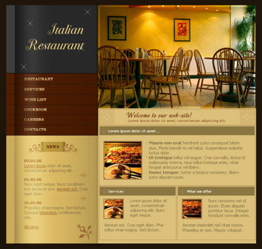
Web Layout for Italian Restaurant
Create a gritty portfolio layout
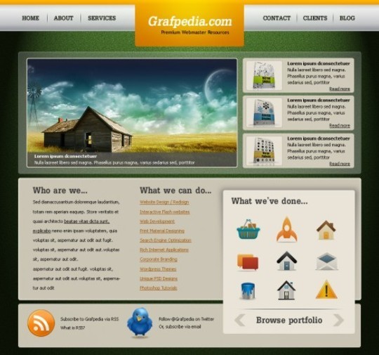
Design a Clean Corporate Website Layout

Design a realistic website layout in photoshop

How to Create an Effective Coming Soon Page

Design a Heavily Textured Portfolio Website
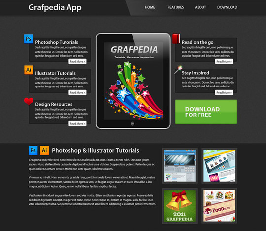
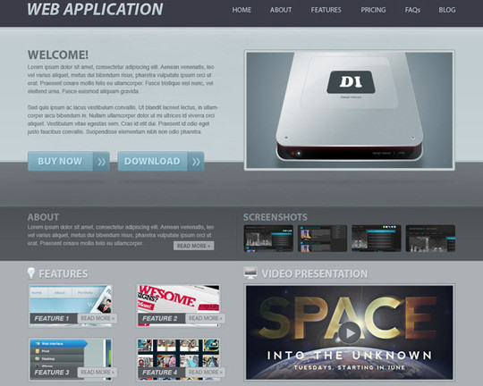
Create a Professional App Store Web Layout

Learn how to create a Grunge Portfolio Layout
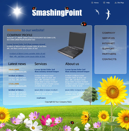
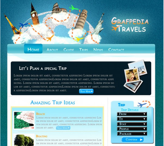
Create a cool Travel Agency layout
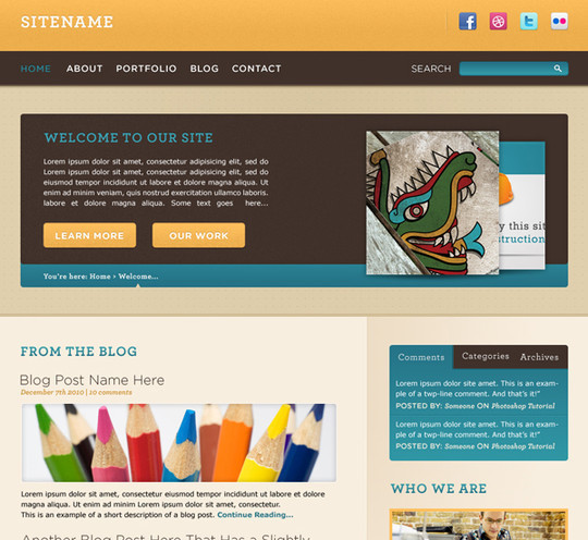
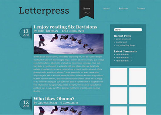
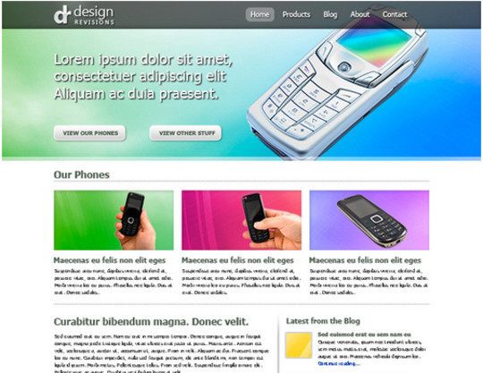
Create a Blog Web Layout With 3D-looking Elements in Photoshop
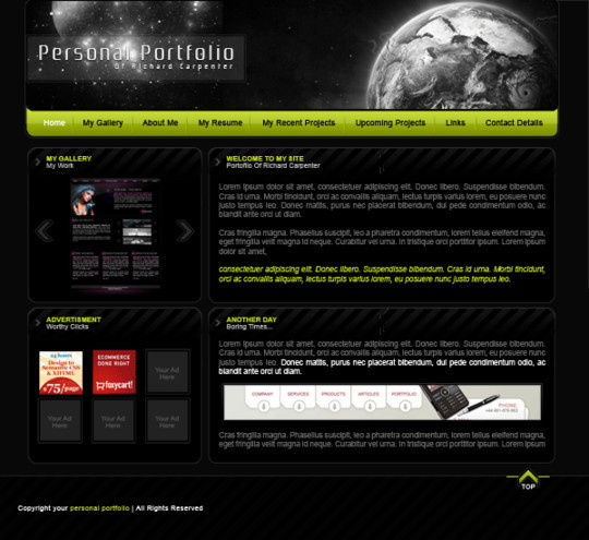
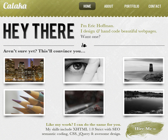
Create a Beautiful and Elegant portfolio in Photoshop
Create a colorful wordpress layout using Photoshop
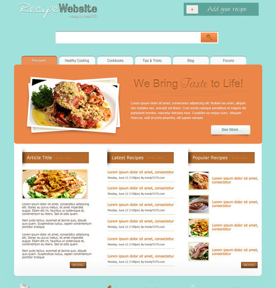
How to create a recipe template in Photoshop
Urban layout perfect for Web Design Company
How to create an elegant business psd template in Photoshop

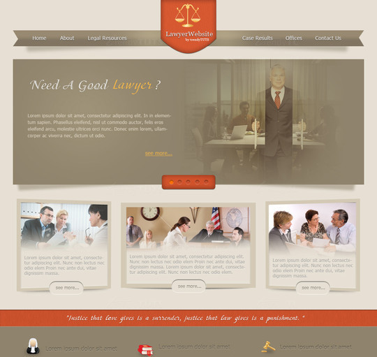
How to design a law/justice website in Photoshop
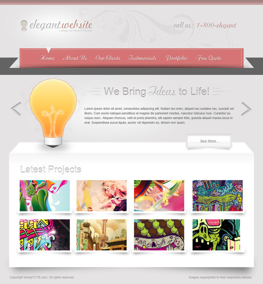
How to design an elegant website in Photoshop
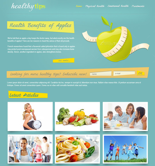
How to design a health/nutrition or a fitness website in Photoshop
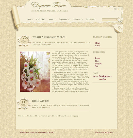
Elegant, Wallpaper style template layout
Learn how to create a stylish/elegant web layout in Photoshop
Create a minimalist web site design in Photoshop

Create a Valentine’s Day Layout with Photoshop
Learn how to create a website layout in Photoshop
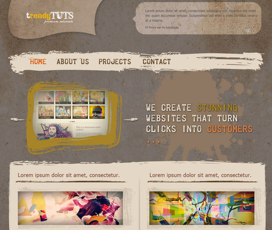
How to create a trendy/colorful wordpress layout in Photoshop
Learn how to create a Sports Car layout in Photoshop

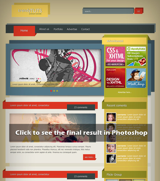
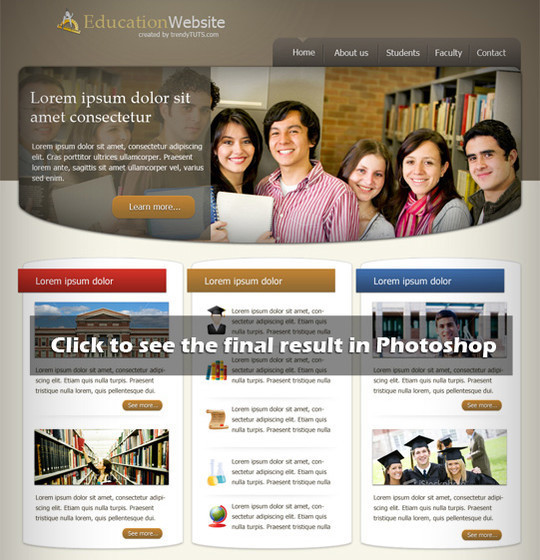
How to design a professional website for your school, college or university
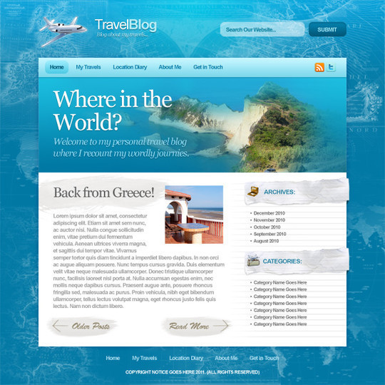
Design a Sleek, Professional Travel Blog
Create an Amazing Layout Using Textures
Design a Cool Textured Portfolio Website

Design a Quick and Clean Portfolio Website

Design a Trendy Yet Professional Website Layout
Create a one-page iPad/iPhone application web layout using Photoshop

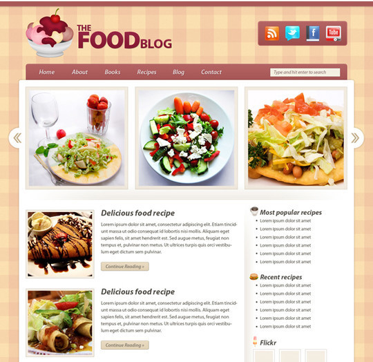
Create a Food Blog Layout in Photoshop
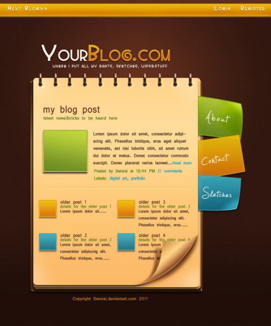
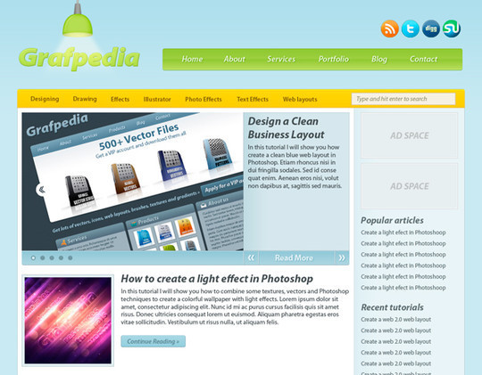
Web 2.0 Professional Blog Layout Tutorial
Code a Textured Outdoors Website
Create a cool and trendy grunge web layout in Photoshop
Create a green energy website in Photoshop

Create a Real Estate Web Layout in Photoshop

Cheerful Website Interface in Adobe Photoshop
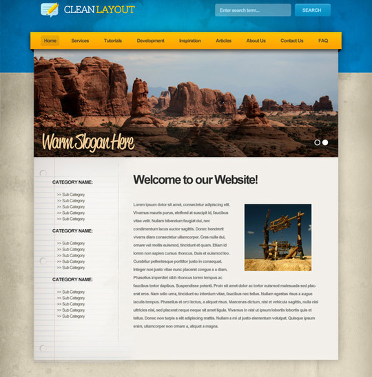
Elegant and Simple CSS3 Web Layout
Create a Web Application Website Design in Photoshop
Create a Vibrant Professional Web Design in Photoshop
Create an Elegant Patterned Web Design in Photoshop
Design a Modern Blog Layout in Photoshop
Brought To You By

Do you want to advertise here? Click to get more info…
50 Best Photoshop Tutorials of 2011 You Should Not Miss
0 comments


