Screen resolution: what web creators need to know
Screen resolution looks technical, but it has real effects on how your site feels. A layout that works on a 13-inch laptop can be cramped on a small phone or blurry on a high-density display. Think of resolution as the canvas size and pixel density as the paint quality. Get both right and your pages will feel fast and crisp; get them wrong and visitors click away.
What screen resolution actually means
Resolution is the number of pixels across and down a screen, like 1366×768 or 1920×1080. Device pixel ratio (DPR) multiplies physical device pixels to CSS pixels. A phone with DPR 3 shows more detail in the same CSS width, so an image sized only for CSS pixels can look fuzzy. Browsers map CSS pixels to device pixels, so you need to serve images and layouts that account for DPR.
Don’t confuse resolution with viewport width. The viewport is the area the browser uses to render your page. Use the meta viewport tag so mobile browsers don’t scale your layout unexpectedly. That keeps breakpoints and media queries reliable.
Practical breakpoints and images that work
Pick breakpoints based on your layout, not device models. Start with these common widths: 360px (small phones), 768px (tablets), 1024px (small laptops), and 1366–1920px (desktops). Test content across these ranges and adjust where the design breaks.
For images, use responsive techniques. Serve multiple sizes with srcset and sizes or use the picture element for art direction. Include higher-resolution files for DPR 2 and 3. Example approach: offer a 400w, 800w, and 1200w version and let the browser pick based on screen size and DPR.
Prefer modern formats like WebP or AVIF where supported. Keep hero images under 200–300 KB after compression, and smaller inline images under 50 KB where possible. Use SVG for icons and simple graphics — they scale freely and stay sharp at any resolution.
Lazy-load offscreen images to cut initial bytes and speed rendering. Combine this with caching headers and a CDN so images are served fast from locations near your users.
Other quick wins: enable HTTP/2 or HTTP/3 on your host, turn on brotli compression, and set long cache lifetimes for static assets. These reduce round trips and make images and CSS load quickly regardless of resolution.
Testing is easy. Use browser devtools to emulate device sizes and DPR values. Run Lighthouse audits to check image sizing and performance. Also try real devices when possible — emulation catches many issues but not all touch or scaling quirks.
Checklist to use now: set a proper viewport meta tag, pick content-driven breakpoints, implement srcset + sizes, serve WebP/AVIF fallbacks, lazy-load images, and use a CDN with compression. Do that and your site will look sharp and load fast on nearly any screen resolution.

- 0 Comments
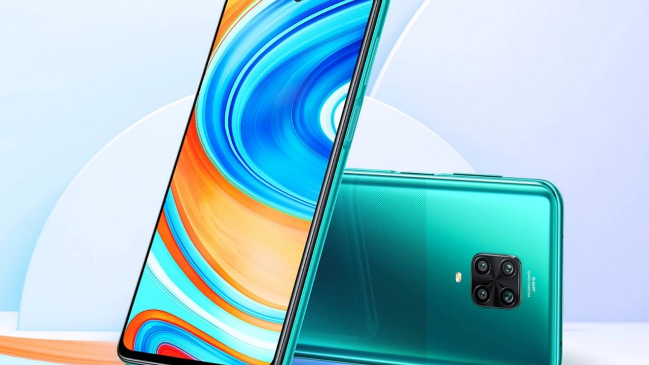
Absolutely, the Redmi Note 9 Pro Max does indeed boast an FHD screen. This means you're getting a full high-definition display, promising crisp visuals and vibrant colors. It's a great feature for those who enjoy streaming videos or gaming on their phone, enhancing the overall user experience. I personally found the display to be quite impressive, especially considering its competitive price point. So, if a high-quality display is high on your checklist, the Redmi Note 9 Pro Max won't disappoint.