Using Social Media To Establish Your Brand Online
Design a Awesome Supernatural Dark Scene with Fiery Effect in Photoshop
0 comments
File Management Tips for Web Designer & Development
0 comments
33 Excellent jQuery Tutorials
0 comments
In this post we have collected some useful and excellent jQuery tutorials for web developers and designer. Enjoy!!
How To Build a Sliding Feature Slideshow with jQuery

Photobooth with PHP, jQuery and CSS3

How To Create a Cool Animated Menu with jQuery

Animated Skills Diagram with Raphaël

Rotating Image Slider with jQuery

Image Wall with jQuery

Thumbnails Preview Slider with jQuery

Fullscreen Gallery with Thumbnail Flip

Moving Boxes Content with jQuery

Sliding Stacked Images With JQuery

Drag Drop Shopping Cart Using JQuery

Sweet Thumbnails Preview Gallery

Better Check Boxes with jQuery and CSS

Shutter Effect Portfolio with jQuery and Canvas

Making a Flickr-powered Slideshow

Simple JQuery Flickr Style Tooltip Menu

Simple Vote Using JQuery Animate

Cover Flow Remade with CSS and jQuery

Rocking and Rolling Rounded Menu with jQuery

Create an Attractive Before and After Photo Effect with jQuery

Animated Form Switching with jQuery

Parallax Slider with jQuery

Advanced jQuery contact form with php support

jQuery and CSS single page portfolio, a vertical parallax navigation

How to Make Auto-Advancing Slideshows

Shuffle Between Images Using JQuery

JQuery Expand Stacked Images Using Slider

Create a Posticks (Sticky Notes) app with HTML5, CSS3 and jQuery

Create an Exploding Logo with CSS3 and MooTools or jQuery

Animated Scroll to Top

creating a modern gallery with raphael

Lets make some mess using jQuery and CSS3

Vintage typewriter: The sexiest jQuery contact form ever

How to Design and Program a Facebook Landing Page
0 comments
 |
We all know that Facebook provides a great opportunity for organizations to connect with their target audience and interact with their clients. To do this more effectively, organizations are creating custom Facebook pages to differentiate themselves and represent their brands on Facebook.
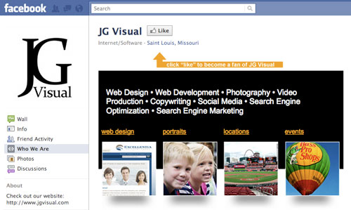
But how does one go about creating one? How exactly should one be designed and what are these iFrames that are used? If you’ve been looking for answers, take a look at this screencast. We’ll be going through an introduction to designing and programming a Facebook landing page using iFrames. Enjoy!
How to Design and Program a Facebook Landing Page from NoupeMag on Vimeo.
Please feel free to share your comments with us in the comment section below.
(il)(rb)
Weekly Design News – Resources, Tutorials and Freebies (N.91)
0 comments
This is our weekly column were we share our favorites design related articles, resources and resources all from the previous week.
If you would like to be kept up to date with loads of fresh design news and resources, you can follow us on Twitter, on Facebook, on Stumbleupon or by subscribing to our RSS feed.
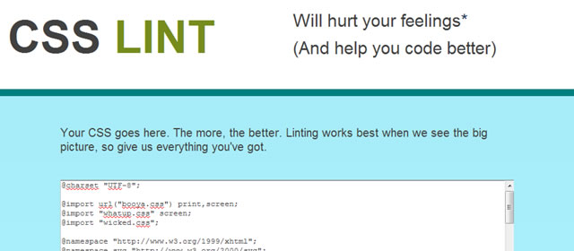
CSS Lint
Perkins CSS3 LESS Framework

Gridless – Boilerplate for Responsive, Cross-Browser Websites

TN3 Gallery – jQuery Image Gallery
TN3 Gallery – jQuery Image Gallery →
Craftyslide – A tiny jQuery Slideshow Plugin

Craftyslide – A tiny jQuery Slideshow Plugin →
Prototype Quickly with flickrBomb
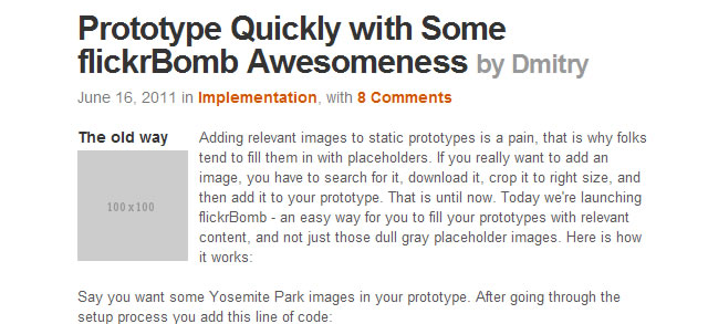
Prototype Quickly with flickrBomb →
Javascript Frameworks and jQuery (Infographic)

Javascript Frameworks and jQuery (Infographic) →
Useful Resources, Tools and Services for Web Designers

Useful Resources, Tools and Services for Web Designers →
8 New Free Fonts for Your Designs

8 New Free Fonts for Your Designs →
The Web Font Combinator

100 Días de Tipografía (100 Days of Typography)

Making a Beautiful HTML5 Portfolio (Tutorial)

Making a Beautiful HTML5 Portfolio →
How to Create an iPad 2 From Scratch Using Photoshop

How to Create an iPad 2 From Scratch Using Photoshop →
White & Blue Web Ui Kit (PSD)
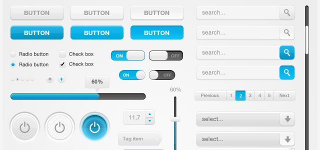
White & Blue Web Ui Kit (PSD) →
Scout Badge Icon Set

8 Beautiful Cameras Icons (PSD)
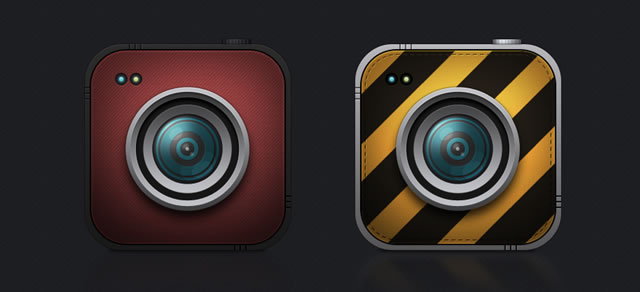
8 Beautiful Cameras Icons (PSD) →
Previous Weekly Design News…
Design News Roundup Archives →
Creating an Enticingly Beautiful Poster in Photoshop
0 comments
The Simple Guide to Text Effects using Layer Styles
0 comments
Typography plays a key part in many kinds of design. Some would even say it’s the most important element of web design, in order to correctly portray your message you have to invite the user to read what you have to say. So how do you make your type stand out? In today’s tutorial I want to cover some of the basics of modifying text using Layer Styles in Photoshop. We’ll learn how to create the “letterpress” look, how to overlay textures and patterns, and how to use tools like Stroke and Bevel. Let’s get things started.
Preview:

We’ll be creating three separate kinds of text styles:
- Creating Letterpress Text
- Overlaying Patterns on Text
- Creating Retro Type using the Stroke Tool
1.) How to create letterpress text.
Letterpress style text has been a staple of web design for a number of years now, and for good reason… it’s slick, stylish, and easy to create.
Step 1
Create a new document sized 485px x 350px and fill it with the color #205175. Add some noise to the background using Filter > Noise > Add Noise using the settings below.

Step 2
Add a white radial gradient to the background before adding your text. Here I’ve use the font Bitstream Serif and the color is #554639.

Step 3
Now it’s time to start styling the text. Open up the Layer Styles window by double clicking on your text layer. Firstly we’ll add a black to white gradient with an opacity of 47% and a the blend mode set to Soft Light.

Step 4
Next we’ll start on the letterpress look by adding an inner shadow. Set the distance to 2px and the size to 4px.

Step 5
To finish off the text we’ll add a light drop shadow that helps complete the letterpress feeling by adding a highlight. Here I’ve used the color #95bcd6, set the distance to 1 pixel, and used an opacity of 78%. And that’s it! See how easy it is to make good looking text?

2.) Overlaying patterns on text.
Overlaying patterns and textures on top of your text can help give some extra visual style to your work and helps to draw the reader in.
Step 1
I’ve created a new document and imported one of these paper textures to use as a background. The font used here is called ChunkFive set to 18pt.

Step 2
Open up the Layer Styles window and select Pattern Overlay. With this tool you can overlay and seamless patterns or textures on top of your text. Here I’ve chosen a seamless wood texture.

Step 3
Next we’ll add a small gradient overlay to the text to help give it a bit more of a three dimensional look. Set the blend mode to overlay and the opacity to 34%.

Step 4
Next we’ll add a drop shadow with a distance of 2px and a size of 2px, with an opacity of 53%.

Step 5
Adding a 1px white inner shadow helps give the text a small highlist and really makes it pop.

Step 6
Lastly we’ll use the Bevel and Emboss tool. I know a lot of designers look down on this particular tool, but I think if it’s used subtly enough it looks pretty good… just don’t overdo it. I’ve set the depth to 1%, the size to 3px, and the shading angle to 90*.
And that completes the wood text! See how easy it is? Hopefully you’re getting the hang of it now.

3.) Creating retro type using the stroke tool.
For the last part of this tut we’ll combine a number of different layer style tools to create text that has a nice retro feel to it.
Step 1
I’ve create a new document, added a simple striped pattern and gradient to the background. The font used here is ABTS Milk and is available through Jay’s FontDeals. The color is #9feef5.

Step 2
Next open up the Layer Styles window and we’ll start off by adding a gradient stroke to the text. Set the size of the stroke to 5px and use a gradient similar to below.

Here is a preview of the gradient that I’ve used:

Step 3
Next we’ll add a subtle gradient to the text. I’ve set the opacity to 70% with a blending mode of screen.

Step 4
Next we’ll use the Inner Glow tool to add a little more detail. I’ve set the color to #eef3ff, the size to 2px, and an opacity of 79%.

Step 5
Use the Bevel and Emboss tool too add a little more depth to the text. I’ve set the size to 2px, depth to 1%, and shading angle to 160*.

Step 6
Lastly we’ll add a heavy drop shadow to help the entire thing “pop” from the background a little bit. Set the distance to 9px, size to 16px, and opacity to 21%.
And that’s it! Now you have a nice looking, basic retro logo that can be made in less than 5 minutes.

Conclusion
This tutorial was intended to touch on just the basics of what you can do with Layer Styles. If you enjoyed it and felt like you learned something new please let me know. I’d love to make some more in depth tutorials about modifying text in Photoshop in the near future.


