
the Network layer services implemented by the TCP/IP protocol suite are the Internet Protocol (IP). Version 4 of IP (IPv4) is currently the most widely-used version of IP.
Role of IPv4(Understanding it briefly)
0 comments
Adding plants to architectural visualisations in Photoshop
0 comments

In this tutorial we will discuss simple techniques to quickly add 2d plants, trees and vegetation to an architectural visualisation post render in photoshop to give the visual a sense of realism. We will use masking techniques to cut out the plants and trees and a number of layer styles to blend them into the [...]
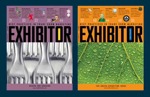
The Top 10 Secrets to Designing a Magazine
0 comments
Each avenue in the design world has its own unique challenges and tricks, and magazine design is no different. From style guides and gutters to editors and entry points, designing for a magazine comprises its own set of rules and considerations. Before jumping head first into the text-heavy, deadline-driven world of magazines, take a moment to get your bearings and familiarize yourself with the terrain. Using the road map below, your creativity, and a bit of luck you’ll have everything you need to produce a top-notch, reader-friendly magazine.
1. Style Guides and Templates
In magazine design, consistency is imperative not only to branding but also to creating familiarity between the magazine and its audience. This familiarity breeds trust and loyalty, and ultimately keeps readers coming back for more. One of the biggest misconceptions in design is that templates and style guides are restrictive. On the contrary, they open the door for more creative solutions. Just like in web design, style guides, style sheets, and templates create consistency and allow for global changes without hassle. Instead of regarding style guides and templates as rules, think of them as the framework holding up the design for each page.
2. Audience First
It’s really that simple. The reader profile should inform your approach to the material. Designing something you like is important, but are you the target audience? Ask yourself, “Does this service the reader?”
3. Diligently Seek Out Inspiration
Working within the same style issue after issue can quickly zap the creative energy right out of you, and unfortunately this will most likely show in your work. Something should surprise the reader every time they turn the page, and achieving that is your responsibility. When you’re feeling uninspired — and you will, eventually — go to a newsstand and flip through other publications, stroll through an art gallery, or simply take a walk. Design is all around you so keep your eyes peeled and refresh your creativity. Many designers keep folders or boxes full of inspiration they’ve collected (such as tear sheets from other publications, art work, postcards, photographs, greeting cards, patterns, fabrics, websites, etc.) near their workspace.
4. Cover Planning
Covers can be the most sensitive and time-consuming part of a magazine issue. Each cover is obliged to achieve several goals. It must attract attention while sitting on a newsstand, adhere to print and postal code regulations, be intriguing while still falling into alignment with brand standards, and — most of all— stand up to the scrutiny of the design and editorial team. Brainstorm, plan ahead, and have a backup plan … or three.
5. Editors Are Your Friends
Magazine staffs often operate with a strict delineation between editorial staff and design staff. However, stronger ideas and solutions emerge when these departments work together early and often. As the designer, familiarize yourself with articles coming down the pipe. You may be able to offer an outside perspective or new approach. Equally, be open to editorial suggestions and help build on them. After all, this is a team project.
6. Typography and Points of Entry
When talking about mass amounts of text, as is the case with most magazine articles, the way in which text is treated and formatted is paramount. As a designer, you have the power to form the way in which the reader is presented with information. With that in mind, text-heavy pages take extra care as you must provide easy points of entry for the reader that lead them through the page. As you see in the example below, a page with no imagery can still be appealing and attention grabbing with the use of grids, headlines, subheads, drop caps and pull quotes. As with many things in design, hierarchy is key.

7. No Budget? No Problem.
Budgets are being slashed around the world and publishing is taking its fair share. Fortunately, there are several inexpensive stock-art websites and photo-sharing sites such as flikr.com that can help out in a pinch. If illustration is a better match for the feature at hand, foster good working relationships with a small pool of illustrators. Illustrators are much more willing to negotiate if you’re a regular customer and can provide steady work. And when all else fails, create what you need. Choose a visual theme appropriate to the article and bask in the freedom. This is when design truly proves its value.
8. Design is in the Details
Take the time to check over the details of each page. Finishing touches are the difference between a professional end product and an amateur one. Clean up and double-check the file for rule alignment, overlapping text and image boxes, unresolved text spacing and breaks, and color matching (e.g., make sure that the same black is used throughout the whole issue).
9. Get to Know Your Printer
The physical production of each issue is a topic in and of itself, but there are a couple pitfalls that can be avoided by simply communicating with your printer. One of the biggest oversights when designing the interior of a magazine is failing to account for the spine. Depending on the size of your magazine and how it is bound, any element that crosses the gutter may lose necessary information such as text on a sign or facial features. Your printer can help you determine the amount of overlap necessary. Also, ask the printer for output specifications to assure that the high-resolution files you provide are compatible with its system. This saves everyone time and saves you extra processing costs.
10. The Big Picture
Designing a magazine is just as much about balance and organization as it is about the text and images on each page. From ad placement to the aesthetic of each feature, designing a magazine requires both a close eye to detail and, conversely, a healthy distance for perspective. The best magazine designers consider each article individually, how those articles fit into a particular magazine issue as a whole, and then how that issue fits into the larger publication set. The end result should showcase your cohesiveness, consistency, and creativity.
Vintage Effect in Photoshop CS5
0 comments

Today we like to share with you a nice video tutorial where we will show you how to easily add a vintage effect to your pictures in Photoshop.
Understanding DHCP
0 comments

The Dynamic Host Confirmation Protocol (DHCP) service enables devices on a network to obtain IP addresses and other information from a DHCP server
Building a Compact jQuery News Ticker
0 comments

Many websites today feature a small news ticker that provides text links to pages with recent news or other features. It’s a great way to highlight important links without using much space.
Surprise someone with a Photoshop Fine Art Portrait
0 comments
In this tutorial, we’ll be looking at how to transform a photo of a person into a work of art – in this case, a highly illustrated sketch art piece.
Vector shapes and textures will also be added to our composition as this will give our sketch artwork more depth and character. Below are examples of what you could achieve even with the simplest of art forms (pop art etc) to create interesting and beautiful effects from a picture. The final images could used as e-cards, profile pictures/avatars, wallpapers and so on.


Step 1
I start with a new document with a white background layer. The dimensions of your documents are of course entirely your choice depending on the size of the picture you’re working with. I’ll be using this picture from istockphoto.

Step 2
Remove the background of the image by creating a Layer Mask clicking the third button from the left. Its located at the base of the Layers Palette. Then press Ctrl+D to make sure that the foreground colour is set to black and with a Soft Round brush (B), (have its hardness increased to about 45
to 60 per cent) paint away to remove the background.
When done, Press Shift+Ctrl+Uto desaturate the ‘Man’ layer.

Step 3
Duplicate the ‘Man’ layer by pressing Ctrl+J and head on over to Image>Adjustment>Invert or just press Ctrl+Ito invert the layer. Also, change the layer’s Blend mode to Color Dodge. The image in the ‘Man inverted’ layer would apparently disappear at this point.

Step 4
The image in the layer will be given more visibility when we have it blur a little. Go to Filter>Blur>Gaussian Blur and set the Blur Radius to about 14.2 pixels and this as a matter of fact, all depends on the results that
suits your likings. The result you get eventually, is nicely rendered sketch effect.

Step 5
To further enhance the pencil-like effects of our simulated sketch, select the duplicate the ‘Man inverted’ layer and go to Filter>Sketch>Graphic Pen. Make the adjustments as shown below:

Step 6
Set the layer’s Blend mode to Lighten and reduce its Opacity to about 23%. Name the layer ‘Graphics’.

B.
Not to make the Graphic Pen effect to brash, go to Edit> Fade Graphic Pen or press Shift+Ctrl+F and reduce the opacity of the effect down to about 60% until you’re satisfied with the results.
Step 7
For a new layer, with a Hard brush selected, paint the eyes of the in the image. Use any colour of your fancy. Set the Blend mode of the ‘Eyes’ layer to Overlay.

Step 8
We’ll now create custom pen strokes to enhance our sketch. Please do use your creative license here to express yourself. Well, with the Pen Tool (P) selected, create Anchor Points over the edges of the head. To create curves, just click and drag in the direction you want the curves created. That done, we’ll now add a stroke to the path. But first, run these checks: make sure your brush’s opacity is appropriate, the brush size should be set to about 2px to 3px and the foreground colour is switched to your desired colour.

Step 9
Still with the Pen Tool, right-click the path and select Stroke Path.

Step 10
On the Stroke Path Dialog box, select Brush and check Simulate Pressure. This creates a nice fading effect to your brush strokes. Use the Marquee Tool (M), to clear the Pen path and then hit Ctrl+D to deselect.

Ive disable the ‘Man’ layers to show you the strokes Ive made with Four
colours, thickness and varying opacities.

The final results:

Step 11
Now, we’ll add vector elements to our image. Select the Rectangle Tool (U) and on its Options bar, set the shape type to “Paths.” Draw a flat rectangle.

Step 12
Select the ‘Add Anchor Point’ Pen Tool and then create points at points on the rectangle. 2. Select the Direct Select Tool (A), and use it to adjust the anchor points to form curves.

Step 13
Double-click the vector layer for a Layer style and set the parameters below:

Step 14
In a new layer, draw an ellipse with the Elliptical Marquee Tool. Paint on the base of the selection with a white Soft Round brush. Reduce the opacity of the layer to about 43%. Add some other shapes to the umbrella – handles etc.

Step 15
Duplicate the Umbrella shape layer and right-click this copy and select the Rasterize Layer option.

Step 16
The Paint Bucket (G), can be used to change the colour of the shape. Reduce the the opacities of the both ‘Umbrella’ layers to 63% and 49% respectively.

Step 17
With the Custom Shape Tool selected, pick the ‘Circle Frame’ shape.

Step 18
Create a couple of circles in separate layers and at reduced opacities.

Step 19
Draw a circle and add a Gradient Overlay Style to it with the settings
below:

Step 20
Reduce the opacity of the circle to43%.

Step 21
Download these great looking halftone brushes from Env1ro. 3D halftones they’re called.

Step 22
Set the foreground colour to #ccccccand add these dots to you image.

Step 23
Add some other vector shapes of your choice.
- Swirlsdownloaded from www.brusheezy.com
- Treesdownloaded from snap2objects.com

Step 24
Its also a good idea to add texture your image as this deepens the entire outlook the composition. This rock texture was downloaded from freetextures.org. Place the rock texture over all other layers and
desaturate it. Set texture layer’s Blend mode to Color Burn and reduce its opacity to 69%.

Step 25
Create a Layer Mask for the texture and clear any trace of the texture from the man image.

Step 26
More texturing. Download these set of Grunge Texture brushes
fromART-D. Apply the brush and add a Shadow Overlay style to the brush mark.

Step 27
Erase areas of brush mark via a Layer Mask and this time, use a Spatter brush instead.

And we have our final result!

You can even take your artwork a little further as Ive done below. Just
imagine the possibilities! I hope this post would be of use to you.


4 Excellent Ideas for Designing Great Business Cards
0 comments
100 Best Photoshop Tutorials For Upcoming Designers
0 comments
20 Excellent Tutorials For Creating Vector Illustrations
0 comments


